Thursday 16 December 2010

What Have I Learnt Since Creating My Preliminary Magazine

I feel my current front cover is a lot better than that of my preliminary magazine.
Preliminary Front Cover

My preliminary magazine front cover was quite plain, as you can see above, it has only a few subheadings and they do not really take up much of the page; which I feel would improve it greatly. I thought that this was the main difference; but there were also smaller differences such as the font for my sub-headings (which was more interesting and eye-catching on my final product) and the colour scheme. There is no real colour scheme above; but there is a clear masculine colour scheme of dark, yet bold colours like grey, black and red on the final piece; as seen below. 

Final Piece: Front Cover.
I got the font for both the masthead and the heading 'George 'n' Ed' from www.dafont.com and I thought this was useful as it caught the eye of the target audience. I also thought that the masthead was more bold, eye-catching and interesting for the audience as it related to the genre of the magazine, which is Drum 'n' Bass.

Thursday 9 December 2010

My Double Page Spread

This is my double page feature article, about two upcoming artists in the specified genre, which is drum 'n' bass. In this article, I have tried to keep the grey, black and red colour scheme going from the front page; and I feel this was done to good effect. It makes the magazine seem more professional and the layout is better organised and clear. I have used close ups of the artists as it makes the article more personal and direct to the readers, they could feel like they have a connection with the artists, I manipulated the photos by cropping them to put the faces of the artists in the middle of the frame. However, I also put in a long shot of the artists working in their flat to vary the photoshoot.

The title is 'new kids on the block' to relate to the less-privelaged people who read the magazine, as they may also live on an estate or a 'block', so they have something to relate to with the new artists. I have used a red font for the key quotes which are scattered across the page to make them eye-catching; I done this so that the readers could gain an insight into the article quickly by looking across the page, and I was hoping that these key quotes would entice them into reading it. I also included links to the website so that readers would go onto it, leading to an increased interest to the magazine as a whole. The masthead at the top of the pages was included for the same reason.

What I have learnt technologically whilst creating my magazine


I have explained the technological skills that I learnt whilst creating my front cover on my front cover post.

Tuesday 7 December 2010

Attracting The Audience To My Music Magazine

I attracted the audience for my magazine through the use of an eye-catching front cover. As I have many friends interested in the genre of music, I know that they like to hear not only about the mainstream bands and artists, but also about up and coming, new artists who are trying to make it in the ‘big time’. 
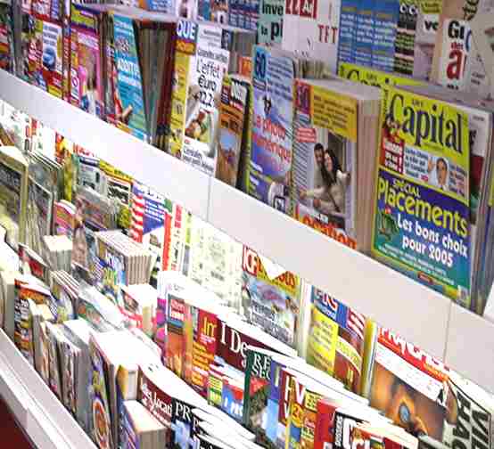
The names of well-known artists could attract my target audience.
This is why I have included a mixture of new artists, (the main feature on the front cover being an interview on a new artist) and more well-known artists, who are shown through subheadings about the best gigs of the year, on my front cover.
Talking of gigs on the front page gives it something to relate to
with the target audience
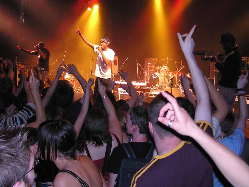
Also, the subheadings about the 'gigs of the year' also gives the audience something to relate to with the magazine as they may have been at those gigs. This would make them want to see if the magazine has the same opinion on the gig as them.  The main image for the main article relates to the target audience as well as it is of young men, so the target audience could feel that they have something in common, a shared interest in the music and a similar age group.
In this video, people in my AS Media class had a look at my production work and answered questions on it. The questions were:
- How can I tell the genre of this magazine?
- What is the purpose and intention of this magazine?
- Who is the target audience for this magazine?

From the feedback on the first question, I found that people could tell what the genre of my magazine was, which is positive because then if it is seen on the shelves, my target audience will realise it relates to them and will be tempted to buy a copy. They could tell this from the effectiveness of the masthead, it showed that the magazine was about music with big beats and this was backed up by the tagline 'strictly big beats' which hinted that this magazine was one which talks of such music as dubstep and drum 'n' bass. The people in the video then went on to say that the images on the contents page of the DJ's enhanced their opinion that the genre of the magazine was drum 'n' bass as it showed the artists on the decks. 

The video also showed that people thought that the purpose and intention of my magazine was to entertain and inform about the artists that I am publicising, which is an accurate interpretation. They thought this was shown through the use of making the interviews with different artists clear on the contents page. They saw interviews as a broad way of both entertaining the reader but also informing them of the successes of certain artists. 

The target audience for the magazine was seen well be the people who fed back to me, but they saw it more broadly. For example, one person said that the target audience was mainly young people and could be aimed at males. This is fairly accurate but they did not sound completely clear about it. This could be seen in a negative and positive light. It may be seen as not making the target audience completely clearly through my production work, however, in an economic sense, it could be useful as if it were being sold in a shop, it may also appeal to girls which could boost the income of the magazine. The person feeding back on this also talked about the colour scheme of grey, black and red hinting at a male target audience which was done by me purposefully as I thought these colours were bold and eye-catching but relevant to the target audience.

Monday 6 December 2010

Distribution of my magazine

I want my music magazine to be widely available so that it is not hard to find for the audience. My music magazine would be distributed in London newsagents and supermarkets as then the target audience would be able to see it when they are doing everyday shopping, especially seeing as the target audience is based in London. I think that many shops and newsagents would like to sell my magazine as it would increase their income, and if teenagers were to come in and buy the magazine, they may purchase other things in the shop. Also, if the magazine is sold in the shop, they could get the target audience on their side for other issues.
Magazine Shelf
In other words, the radicals that read the magazine may agree with the political views of the shopkeeper and as a result they could create a personal relationship with them and then want to come back to that shop each time. In addition, I would look to create a website for my magazine as well because my young target audience would use it quite a lot and this could then persuade them to go and buy the physical copy, in turn increasing the profits and income for my magazine as a whole.
An example of a newsagents


I would also like to sell my magazine is a more traditional magazine retail outlet such as WHSmith, because once it is being sold at places such as this the audience will realise that the magazine is one which is recognised on a national level; although based around a London target audience. Another retail outlet that I would be interested in distributing my magazine to is HMV as they are associated with music in a great way and recognised as a huge outlet for the major music scene as they sell specialist music publications.


I have also thought about the type of publishing company that would create my magazine and represent it. After researching the best publishers, I have decided to use IPC Media as they seem to be the most famous and professional company, and there website was clear and easy to use. It is also the company that represents many other famous, big names in terms of the magazine industry which is important as we could create ties with other magazines, even link together; share ideas or pictures. 

Thursday 2 December 2010

Magazine Contents Page And How It Has Improved Since The Preliminary Task


I used the NME contents page to get inspiration for my own. They are not too similar as I wanted to challenge the norms of magazines, however, I have used a consistent colour scheme just like NME, and I got the idea to do an advert for a subscription for the magazine from NME. I think my colour scheme works well as they colours contrast well, so all the writing is easy to see, even if it is on a photo.
NME contents page.
Helped me on the layout of my magazine.

The colour scheme is different to my preliminary magazine as on the front cover for that magazine, it was difficult to read some of the subheadings as the background photo took up too much space, I should have formatted a shape so that the text could be seen more clearly.  Because of this problem, I did not include many headings, which means that the target audience will be less likely to be the magazine.
Preliminary task.

Wednesday 1 December 2010

How My Magazine Challenges Real Magazines

I have purposefully made my magazine alternative to the usual, as I believe that the target audience for my magazine are radicals and this would suit what they wanted from a magazine. I got the inspiration for the design of my magazine from Kerrang! magazine and NME magazine. I thought those magazines aimed at a similar audience to mine so this would be relevant.
I took inspiration from kerrang and NME.
Masthead
I thought my masthead was quite unique and interesting compared with many others about at the moment. It seems like many magazines have a fairly simple masthead, so I decided to go against this and put a lot of thought and consideration into mine. It represents the outspoken nature of the loud target audience. The letters are almost splattered across the top of the front cover which links to the strapline of "strictly big beats" as the letters look like speakers being boomed out as a result of 'big beats'. It again links to the target audience through the use of the acronym "DNB", standing for drum 'n' bass, which is the genre of music for the magazine. The masthead is black with a red shadow to give it a mature, yet mysterious feel. Not many mastheads contain more than one colour so I thought it would be a unique way of doing it.
Front page with main image

The main image is taken in an untidy flat which also challenges the norms for magazines in today's society, and relates to my target audience who will have something in common with the artists in the image. I felt this was necessary because a lot of the magazines these days make artists seem superior to their readers and I thought it would be a useful way of hooking in the readers by making them seem level with the upcoming artists.

Magazine Front Cover


To make this magazine front cover, I used many different tools. The layer organiser was used to put the layers in the right order, making sure they do not overlap. 
Layer organiser

I also used the locking tool to link some layers together so I could move them as a group if needed. I used this tool to create the masthead as there was many different layers to the masthead itself. 
All these layers were locked to create my masthead.
The little symbol of  a lock is shown on the right
of the actual layer name.
I also kept the black and red colour scheme going by using the font colour tool, you can take a sample of other colours when on the font colour tool to keep the same colours throughout your work.
Font colour tool.

I also used consistent fonts throught the font selection tool. For the writing on the contents page I used 'trajan pro' font, whereas on the front page I used 'thirsty for souls' font for my heading "George 'N' Ed".