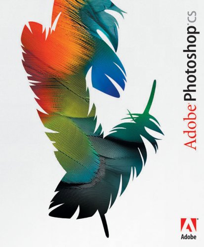
 We were told to use Adobe Photoshop so that we could develop our skills with the programme and, as a result, make our actual coursework piece better overall. I am not the most experienced with Photoshop, so I liked this idea. Later in the Blog, I will describe the technological skills I learnt throughout this coursework. Our first layer of the page was the masthead, I decided to go for an enhanced shadow behind my green and red striped masthead to make it more bold, so that it would stand out more and catch the audience's eye. I done this with the blending options tool, making the colour of the title two different colours into one which made it look a little like graffiti, which again appeals to the target audience. The next layer is a black background to the title which makes it stand out more, the colours of the title blended well with the background, which made this part of the magazine more unique and memorable. Also, with this layer, I was able to put in a strapline which told the audience what was in the magazine in short form. In the strapline, I included things that I thought would interest the target audience like 'competitions' and 'puzzles' so that they would be more likely to buy the magazine. I created another layer with a background of the same colour as the one behind the title for the bottom of the page, where I added in the web address for the magazine. I thought these two things were probably the most important things to remember for the reader, which was why I used the same background for them both and put in a striking colour and font.
I used a main image of me standing in the playground of our school as I thought that the target audience would be able to relate with the magazine if they saw that the main feature was based in the school. Also, I think the main image is appropriate as I am looking upwards to hint at a positive future, my body language is one of confidence which could inspire readers because the 'ex-student' of their school has made it as a successful music artist. I have written in short form around the front cover so that the reader can get a general view of what's inside from a quick look at the front cover. I think it will also be necessary to put in pictures by the text so that it is easy to tell what the piece is about. I done a similar structure for my contents page, put the headings for the different sections of the magazine across the page and writing details underneath them, aswell as pictures so that the readers can get an easy vision of what the page will look like.

I believe this front cover could be improved by containing more headings around the main image to tell the audience what is in the magazine, because if the headings interest them, they will then be more likely to buy the magazine. It is good that I am learning this now because I can now apply these things into my real magazine front cover.
I believe this front cover could be improved by containing more headings around the main image to tell the audience what is in the magazine, because if the headings interest them, they will then be more likely to buy the magazine. It is good that I am learning this now because I can now apply these things into my real magazine front cover.