Thursday 16 December 2010

What Have I Learnt Since Creating My Preliminary Magazine

I feel my current front cover is a lot better than that of my preliminary magazine.
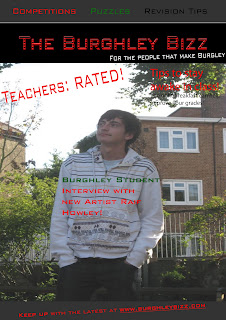
Preliminary Front Cover

My preliminary magazine front cover was quite plain, as you can see above, it has only a few subheadings and they do not really take up much of the page; which I feel would improve it greatly. I thought that this was the main difference; but there were also smaller differences such as the font for my sub-headings (which was more interesting and eye-catching on my final product) and the colour scheme. There is no real colour scheme above; but there is a clear masculine colour scheme of dark, yet bold colours like grey, black and red on the final piece; as seen below. 

Final Piece: Front Cover.
I got the font for both the masthead and the heading 'George 'n' Ed' from www.dafont.com and I thought this was useful as it caught the eye of the target audience. I also thought that the masthead was more bold, eye-catching and interesting for the audience as it related to the genre of the magazine, which is Drum 'n' Bass.

Thursday 9 December 2010

My Double Page Spread

This is my double page feature article, about two upcoming artists in the specified genre, which is drum 'n' bass. In this article, I have tried to keep the grey, black and red colour scheme going from the front page; and I feel this was done to good effect. It makes the magazine seem more professional and the layout is better organised and clear. I have used close ups of the artists as it makes the article more personal and direct to the readers, they could feel like they have a connection with the artists, I manipulated the photos by cropping them to put the faces of the artists in the middle of the frame. However, I also put in a long shot of the artists working in their flat to vary the photoshoot.

The title is 'new kids on the block' to relate to the less-privelaged people who read the magazine, as they may also live on an estate or a 'block', so they have something to relate to with the new artists. I have used a red font for the key quotes which are scattered across the page to make them eye-catching; I done this so that the readers could gain an insight into the article quickly by looking across the page, and I was hoping that these key quotes would entice them into reading it. I also included links to the website so that readers would go onto it, leading to an increased interest to the magazine as a whole. The masthead at the top of the pages was included for the same reason.

What I have learnt technologically whilst creating my magazine


I have explained the technological skills that I learnt whilst creating my front cover on my front cover post.

Tuesday 7 December 2010

Attracting The Audience To My Music Magazine

I attracted the audience for my magazine through the use of an eye-catching front cover. As I have many friends interested in the genre of music, I know that they like to hear not only about the mainstream bands and artists, but also about up and coming, new artists who are trying to make it in the ‘big time’. 
The names of well-known artists could attract my target audience.
This is why I have included a mixture of new artists, (the main feature on the front cover being an interview on a new artist) and more well-known artists, who are shown through subheadings about the best gigs of the year, on my front cover.
Talking of gigs on the front page gives it something to relate to
with the target audience
Also, the subheadings about the 'gigs of the year' also gives the audience something to relate to with the magazine as they may have been at those gigs. This would make them want to see if the magazine has the same opinion on the gig as them.  The main image for the main article relates to the target audience as well as it is of young men, so the target audience could feel that they have something in common, a shared interest in the music and a similar age group.
In this video, people in my AS Media class had a look at my production work and answered questions on it. The questions were:
- How can I tell the genre of this magazine?
- What is the purpose and intention of this magazine?
- Who is the target audience for this magazine?

From the feedback on the first question, I found that people could tell what the genre of my magazine was, which is positive because then if it is seen on the shelves, my target audience will realise it relates to them and will be tempted to buy a copy. They could tell this from the effectiveness of the masthead, it showed that the magazine was about music with big beats and this was backed up by the tagline 'strictly big beats' which hinted that this magazine was one which talks of such music as dubstep and drum 'n' bass. The people in the video then went on to say that the images on the contents page of the DJ's enhanced their opinion that the genre of the magazine was drum 'n' bass as it showed the artists on the decks. 

The video also showed that people thought that the purpose and intention of my magazine was to entertain and inform about the artists that I am publicising, which is an accurate interpretation. They thought this was shown through the use of making the interviews with different artists clear on the contents page. They saw interviews as a broad way of both entertaining the reader but also informing them of the successes of certain artists. 

The target audience for the magazine was seen well be the people who fed back to me, but they saw it more broadly. For example, one person said that the target audience was mainly young people and could be aimed at males. This is fairly accurate but they did not sound completely clear about it. This could be seen in a negative and positive light. It may be seen as not making the target audience completely clearly through my production work, however, in an economic sense, it could be useful as if it were being sold in a shop, it may also appeal to girls which could boost the income of the magazine. The person feeding back on this also talked about the colour scheme of grey, black and red hinting at a male target audience which was done by me purposefully as I thought these colours were bold and eye-catching but relevant to the target audience.

Monday 6 December 2010

Distribution of my magazine

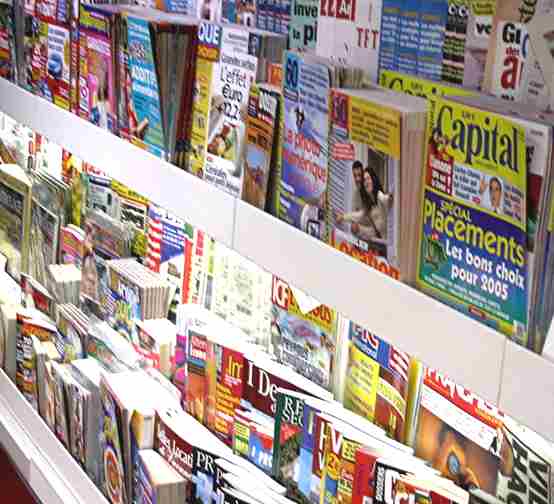
I want my music magazine to be widely available so that it is not hard to find for the audience. My music magazine would be distributed in London newsagents and supermarkets as then the target audience would be able to see it when they are doing everyday shopping, especially seeing as the target audience is based in London. I think that many shops and newsagents would like to sell my magazine as it would increase their income, and if teenagers were to come in and buy the magazine, they may purchase other things in the shop. Also, if the magazine is sold in the shop, they could get the target audience on their side for other issues.
Magazine Shelf
In other words, the radicals that read the magazine may agree with the political views of the shopkeeper and as a result they could create a personal relationship with them and then want to come back to that shop each time. In addition, I would look to create a website for my magazine as well because my young target audience would use it quite a lot and this could then persuade them to go and buy the physical copy, in turn increasing the profits and income for my magazine as a whole.
An example of a newsagents


I would also like to sell my magazine is a more traditional magazine retail outlet such as WHSmith, because once it is being sold at places such as this the audience will realise that the magazine is one which is recognised on a national level; although based around a London target audience. Another retail outlet that I would be interested in distributing my magazine to is HMV as they are associated with music in a great way and recognised as a huge outlet for the major music scene as they sell specialist music publications.


I have also thought about the type of publishing company that would create my magazine and represent it. After researching the best publishers, I have decided to use IPC Media as they seem to be the most famous and professional company, and there website was clear and easy to use. It is also the company that represents many other famous, big names in terms of the magazine industry which is important as we could create ties with other magazines, even link together; share ideas or pictures. 

Thursday 2 December 2010

Magazine Contents Page And How It Has Improved Since The Preliminary Task


I used the NME contents page to get inspiration for my own. They are not too similar as I wanted to challenge the norms of magazines, however, I have used a consistent colour scheme just like NME, and I got the idea to do an advert for a subscription for the magazine from NME. I think my colour scheme works well as they colours contrast well, so all the writing is easy to see, even if it is on a photo.
NME contents page.
Helped me on the layout of my magazine.

The colour scheme is different to my preliminary magazine as on the front cover for that magazine, it was difficult to read some of the subheadings as the background photo took up too much space, I should have formatted a shape so that the text could be seen more clearly.  Because of this problem, I did not include many headings, which means that the target audience will be less likely to be the magazine.
Preliminary task.

Wednesday 1 December 2010

How My Magazine Challenges Real Magazines

I have purposefully made my magazine alternative to the usual, as I believe that the target audience for my magazine are radicals and this would suit what they wanted from a magazine. I got the inspiration for the design of my magazine from Kerrang! magazine and NME magazine. I thought those magazines aimed at a similar audience to mine so this would be relevant.
I took inspiration from kerrang and NME.
Masthead
I thought my masthead was quite unique and interesting compared with many others about at the moment. It seems like many magazines have a fairly simple masthead, so I decided to go against this and put a lot of thought and consideration into mine. It represents the outspoken nature of the loud target audience. The letters are almost splattered across the top of the front cover which links to the strapline of "strictly big beats" as the letters look like speakers being boomed out as a result of 'big beats'. It again links to the target audience through the use of the acronym "DNB", standing for drum 'n' bass, which is the genre of music for the magazine. The masthead is black with a red shadow to give it a mature, yet mysterious feel. Not many mastheads contain more than one colour so I thought it would be a unique way of doing it.
Front page with main image

The main image is taken in an untidy flat which also challenges the norms for magazines in today's society, and relates to my target audience who will have something in common with the artists in the image. I felt this was necessary because a lot of the magazines these days make artists seem superior to their readers and I thought it would be a useful way of hooking in the readers by making them seem level with the upcoming artists.

Magazine Front Cover


To make this magazine front cover, I used many different tools. The layer organiser was used to put the layers in the right order, making sure they do not overlap. 
Layer organiser

I also used the locking tool to link some layers together so I could move them as a group if needed. I used this tool to create the masthead as there was many different layers to the masthead itself. 
All these layers were locked to create my masthead.
The little symbol of  a lock is shown on the right
of the actual layer name.
I also kept the black and red colour scheme going by using the font colour tool, you can take a sample of other colours when on the font colour tool to keep the same colours throughout your work.
Font colour tool.

I also used consistent fonts throught the font selection tool. For the writing on the contents page I used 'trajan pro' font, whereas on the front page I used 'thirsty for souls' font for my heading "George 'N' Ed".


Monday 29 November 2010

Magazine analysis

We were told to anlayse our front cover and contents page in terms of how the images were changed to suit particular social groups.Magazine analysis
View more presentations from rhowley94.

Monday 22 November 2010

Magazine Photo Analysis - How Social Groups Have Been Represented

We were told to analyse the photos we planned to use for our final coursework magazine task, analysing how they represent particular social groups. I chose to take photos of some DJ's in their flat whilst playing and doing an interview with my magazine. This answers the evaluation question 2 "How does your magazine represent particular social groups?"
Here is the analysis of why these photos were appropriate:


Organisation of photoshoot:
For this photoshoot, I used two of my brothers friends as the 'artists', as they are part time DJ's and do it for fun. I felt this was appropriate because they had the correct equipment and knowledge of the genre. They could develop my knowledge as a result. I chose to use their flat as the place to take the photos as it gave the photos a more relaxed, laid-back feel. Also, this way the 'artists' would feel more laid-back and the photos would give a more accurate picture of how they usually performed.

Laid-back atmosphere.
To make the photoshoot safe, I made sure that all the wires that were being used were not hanging around on the floor, otherwise people could trip over them.
I used this time also to interview the boys as they were the main feature for my magazine article. To make this safe, I made sure that they were not asked questions while they were on the decks, because if they were, the 'artists' could get distracted and unintentionally damage the equipment.
Wires are on the table rather
than the floor.

Mastheads

I produced a choice of three different mastheads for my magazine front cover. Here is a little analysis on them, and why I have chosen the one that I did.

Who Is My Audience? Target Audience Profile

I have chosen to create a moodboard to represent my target audience ofr my magazine. I felt it was clear through these images that my magazine is aimed towards a young, modern male target audience from London. I chose to put in some pictures of things that they may do in their spare time like football, gigs and using technology including iPods and phones. I chose to represent the target audience by showing that they are quite rebellious through the use of a Banksy image. I feel his art shows the creative side of them, but also the lawlessness. Here is the moodboard:

Tuesday 16 November 2010

Magazine Front Cover Flat Plan

This is how I originally wanted my magazine front cover to look like, but it may change after this creation, as I could take inspiration from different magazine front covers. This front cover has no colour but I believe it has an interesting layout:

Magazine Plan

I have planned the target audience, genre and gratifications of my magazine on an A3 piece of paper. I decided that the main purpose for the magazine was to entertain and inform, and to be a diversion from everyday life. The main genre is drum 'n' bass, along with dubstep.
Here is a photo of my magazine plan:

I have chosen to make my target audience male, between 15 and 25, who enjoy drum 'n' bass, or any other music with loud beats. I think the magazine will be most useful to divert people away from the stresses of everyday life as it uses an entertaining writing style, and exclusive pictures. It will also be a surveillance magazine as it is informative about new artists and gig dates. The psychographics of the magazine are radicals, because I think the music is usually associated with lawlessness and people who like to be heard; they are not afraid to go against society. I have tried to reflect this in the layout of my magazine as I believe this will catch my audience's eye. Also, those who read the magazine may be aspirers because they may aspire to be music artists and could take inspiration from these new artists.

Monday 8 November 2010

Analysis of Front Pages

I decided that to make my magazine front cover relevant to my target audience, I should analyse two front covers with different target audiences and notice the similarities to include in my front cover. I want to do this to broaden my target audience.
I believe the Kerrang! front page is quite packed and contains a lot of headings so the audience can easily see what is in the magazine. This is done to make them want to read it if they see something on their favourite band or artist. If they include a lot of headings, it is more likely that someone will see something they like so I think this would be relevant for my own front cover. The main image is of a well-known artist who many of the audience will recognise and this will make them want to read the magazine as they will be interested to find out why this artist is on the front. It looks as though the demographics for Kerrang! is diversion and entertainment because of the shapes on the front cover, it is grabbing the readers attention and is quite unique and out-of-the-ordinary overall. The colour of the artist's hair and clothes contrasts to the grey background to make her stand out even more. 
RWD's front cover is a lot more simplistic than Kerrang! it only has one image, compared to the four on the front of Kerrang!, however, the main image on RWD is split into three; which links it to the heading as it makes it seem as though Tinie Tempah does "tear" up the photo as well as the music scene. The colour of the title and the headings all match making a colour scheme on the front cover of blue and white, hinting at a male target audience; which is emphasised by the popular male artist on the front cover. The artist on the front sums up the genre of the magazine, and we can tell he must be liked by many because otherwise the target audience would not buy it. The simplistic feel would suggest that this magazine is confident that it's target audience are going to buy it from the start, not caring so much for the look of the front cover.

I included a table to make the similarities and differences easy to see, and it is after the analysis of the two pages.

Friday 5 November 2010

Masthead Research

We were told to analyse some different mastheads so that we would have more knowledge on them when we created our own for the our coursework, the music magazine. Here is my Masthead research:


Blog Research

I decided to research some blogs to see if I could get some tips from those that are popular. Also, I looked for similarities between them and from this I found that I could be unique with my style of blog.

Analysis of Prelim Magazine Photos

We were told to analyse our original photography for our preliminary task, in terms of how it relates to our target audience and how we manipulated them to suit that audience.School mag photo analysis
View more presentations from rhowley94.

I used the picture options to manipulate the photos.

Tuesday 2 November 2010

Online Magazine Research. The Fly Magazine.

We were told to analyse an online magazine so when we created ours, we would be able to make it more versatile and cater for a wider audience. Here is my slideshow about The Fly magazine :

Sunday 31 October 2010

Preliminary Task. Magazine Front Cover


Before starting our Media Coursework of a music magazine, it was decided that we should make a model magazine front cover so that we could improve on our preliminary work. We had to create the magazine front cover, make it about our school (Acland Burghley), take our own picture for the main image and decide on our own magazine title. I chose to call may magazine The Burghley Bizz, because I thought the slang of 'Bizz' would appeal to the young target audience and the alliteration of the 'B' would make the title more memorable.

We were told to use Adobe Photoshop so that we could develop our skills with the programme and, as a result, make our actual coursework piece better overall. I am not the most experienced with Photoshop, so I liked this idea. Later in the Blog, I will describe the technological skills I learnt throughout this coursework. Our first layer of the page was the masthead, I decided to go for an enhanced shadow behind my green and red striped masthead to make it more bold, so that it would stand out more and catch the audience's eye. I done this with the blending options tool, making the colour of the title two different colours into one which made it look a little like graffiti, which again appeals to the target audience. The next layer is a black background to the title which makes it stand out more, the colours of the title blended well with the background, which made this part of the magazine more unique and memorable. Also, with this layer, I was able to put in a strapline which told the audience what was in the magazine in short form. In the strapline, I included things that I thought would interest the target audience like 'competitions' and 'puzzles' so that they would be more likely to buy the magazine. I created another layer with a background of the same colour as the one behind the title for the bottom of the page, where I added in the web address for the magazine. I thought these two things were probably the most important things to remember for the reader, which was why I used the same background for them both and put in a striking colour and font.

I used a main image of me standing in the playground of our school as I thought that the target audience would be able to relate with the magazine if they saw that the main feature was based in the school. Also, I think the main image is appropriate as I am looking upwards to hint at a positive future, my body language is one of confidence which could inspire readers because the 'ex-student' of their school has made it as a successful music artist. I have written in short form around the front cover so that the reader can get a general view of what's inside from a quick look at the front cover. I think it will also be necessary to put in pictures by the text so that it is easy to tell what the piece is about. I done a similar structure for my contents page, put the headings for the different sections of the magazine across the page and writing details underneath them, aswell as pictures so that the readers can get an easy vision of what the page will look like.

I believe this front cover could be improved by containing more headings around the main image to tell the audience what is in the magazine, because if the headings interest them, they will then be more likely to buy the magazine. It is good that I am learning this now because I can now apply these things into my real magazine front cover. 

Tuesday 28 September 2010

Content Analysis and Target Audience


The two magazines I have analysed in class are NME mgazine and Top of the Pops! magazine. Just from looking at the two magazines, I can infer that NME is aimed at a more mature audience than Top of the Pops!
The front cover of NME is quite dark, which could symbolize a rock audience, and I can tell that the features are aimed at young adults as they are reviewing this summer's festivals and talking to bands.
However, for Top of the Pops!, the front cover is bright and colourful which would have caught a young audience's eye, and they would have recognised the famous face of Justin Bieber on the front cover, the main colours used are pink and blue which would hint that they are aiming at a young female audience for their magazine. 
Interestingly, when I looked at both the magazines, it was clear to see that there was a large proportion of the magazines devoted to adverts, and more so in NME than Top of the Pops!.
NME has a majority of the magazine devoted to it's features, however, the rest of the magazine is devoted to adverts, TV/Radio listings and gig dates. I am now going to go through some of the adverts in the magazine and talk about why they make me come to the conclusion of a young adult, mainly male target audience. 
The first advert in the magazine is a 'Halo: Reach' advert, it is a four page advert, with the pages folding out, making the advert look like a poster. I believe this advert hints at a teenage or young adult audience, predominantly male as Halo: Reach is a video game that involves violence. The fact that it has taken up a large part of the magazine could show that Halo realise that their target audience is similar to NME's.
Later in the magazine, there is an advert for the release of Kano's new album 'Method to the Madness'. I believe again that this is aiming at a male audience, teenage to young adult. I think that this advert shows that NME reports on a variety of music genres, as the main focus beforehand was on rock music, but Kano is a grime artist. This could prove that NME has a broad target audience. Having said that, it only took up around half a page towards the back of the magazine so you could infer that NME does not focus too much on grime.
There are also 4 pages taken up by concert and gig dates, which would hint to a young audience again, maybe between the ages of 15 and 30. This shows again that NME has a broad target audience, as the concerts and gigs did not focus on one single genre of music, they focused on many different genres. 

Also, in the last five pages or so of the magazine, there are many small adverts, which I believe will be in there for the benefit of profits, it will be difficult to find some correlation between the adverts and the target audience.  
Proportions of pages in NME


Also, in NME, there are no 'letter pages' which may hint at a older audience, as they may feel that an older audience may not have the time to write in with a letter, so they reached a compromise when introducing polls to the features such as the reviews of festivals. 
Top of the Pops! had a lot of adverts in their magazine, but the main features made up at least three quarters of the pages. The adverts were usually promoting products aimed at young females, this was clear to see as the main colour used in the adverts was pink and purple. 
The first advert was one for 'Always' tampons, which is clearly aiming at a female audience and because they used pink for the packaging you could infer that they wanted to catch the eye of a young audience, maybe between 12 and 15. 
In Top of the Pops, there are also competitions which are aimed at women, so you could say that older women could make up a small percentage of the target audience, the most notable competition was the 'girly night in London for four', you had to be over 18 to enter the competition so it must be aiming at a slightly more mature audience than normal. 
There is a page in the magazine on phone updates and games as well, which is clearly aimed at a young, female, teenage audience, as the background was pink and the wallpapers were quite girly, with pictures of male popstars being the main attraction. 

There is a letter page in Top of the Pops!, which could suggest a young female audience as teenage girls like to have someone to speak to who has another opinion on how to solve their problems.

Proportion of pages in TOTP. A higher proportion of pages devoted to features than NME.

Overall, I think there is a lot in this magazine to suggest that Top of the Pops! aims it's magazine at teenage girls.

Monday 20 September 2010

Introduction

I am Raif Howley and I'm studying Media AS at La Swap sixth form. I have been asked to create a blog to show the stages of creating my first Media coursework, which is to create not only the front cover of a music magazine, but also the contents page and a two-page feature. I don't have a particular preference in terms of style of music, as I like a lot of different types, including hip hop/r'n'b, pop, classic rock, grime, alternative, soul, dubstep, drum 'n' bass and some dance. My favourite song at the moment is found in the video below: